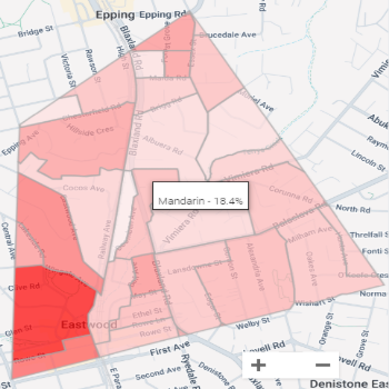
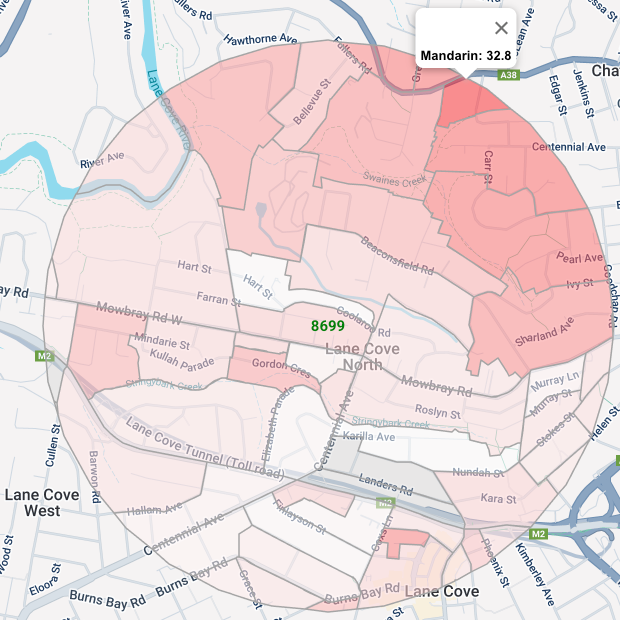
Heatmaps
See where community groups cluster.
Zero in on key stakeholders
Heatmaps highlight where a single group is concentrated, such as harder-to-reach
cohorts and high-value customers. Use the filter function to find people using multiple demographic indicators.
How to use heatmaps
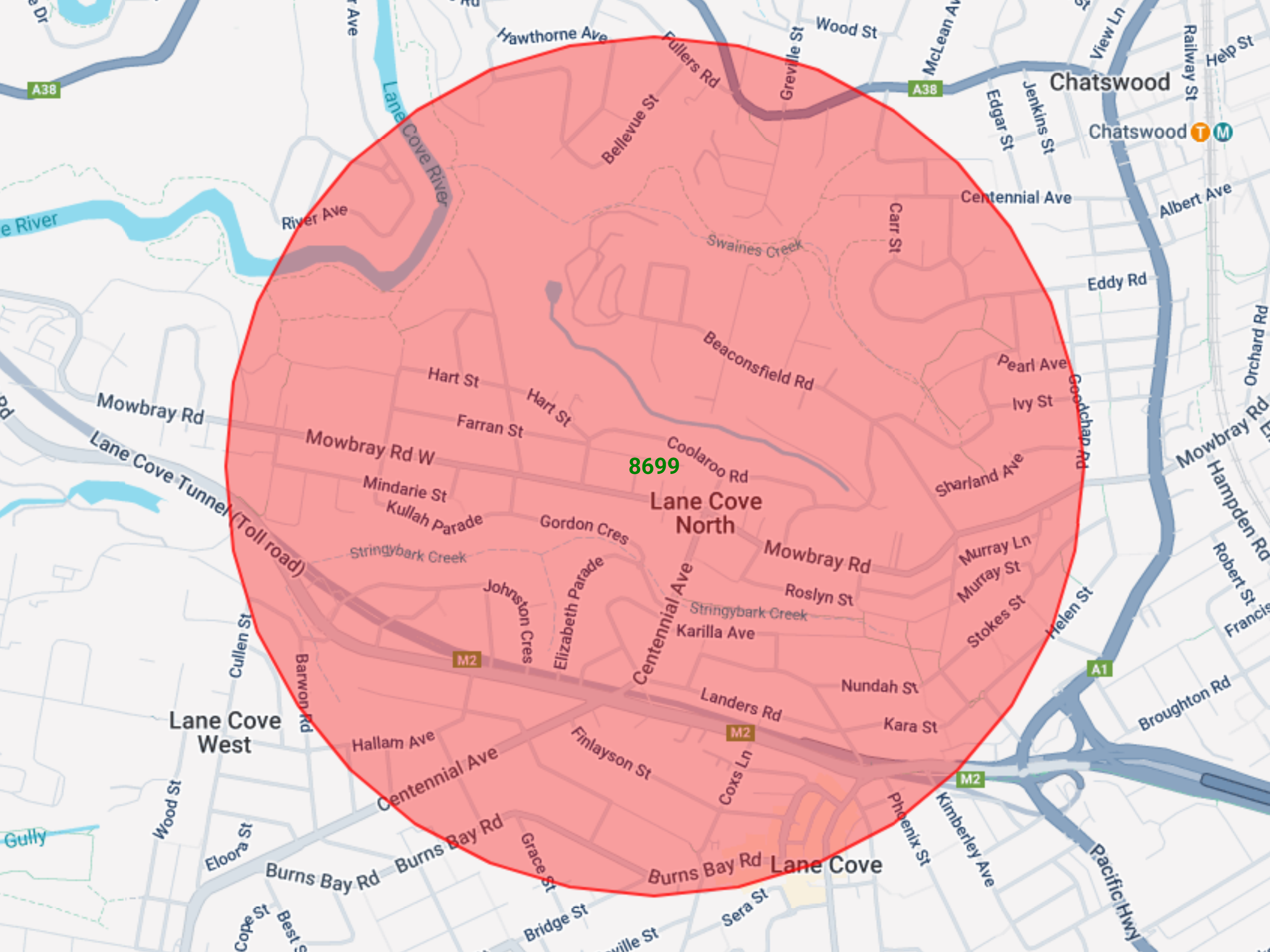
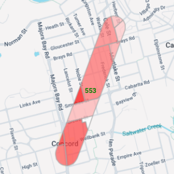
1. Select an area
Select an area using any of the mapping tools (polygon map, radius map or radial line map).
-1.png)
2. Select heatmap
Click the heatmap function at the top of the page (see orange icon in image).
-1.png)
3. Select demographic indicator
Click the demographic indicator of interest e.g. 25–29-year-olds. The darker shaded areas indicate higher concentrations of a specific demographic